This is a sample technical specification, a part of Joel on Software, a site about software management. It is intended for educational purposes, not to refer to a real product, in case you didn't notice by how stupid the whole thing was. Attention VCs, especially dim-witted ones: this product idea can be built for $5m at $20m-pre.
WhatTimeIsIt.com
Functional Specification
Joel Spolsky
Last Updated: September 27, 2000
- C O N F I D E N T I A L -
© 2000 Fog Creek Software, Inc. All Rights Reserved.
WhatTimeIsIt.com is a service that tells people what time it is, over the web.
This spec is not, by any stretch of the imagination, complete. All of the wording will need to be revised several times before it is finalized. The graphics and layout of the screens is shown here merely to illustrate the underlying functionality. The actual look and feel will be developed over time with the input of graphics designers and iterative user feedback.
This spec does not discuss the algorithms used by the time calculation engine, which will be discussed elsewhere. It simply discusses what the user sees when they interact with WhatTimeIsIt.com.
In designing products, it helps to imagine a few real life stories of how actual (stereotypical) people would use them. We'll look at two scenarios.
Scenario 1: Mike.
Mike is a busy executive. He is the president of a large, important company
that makes dynamite-based products for children which are sold through national
chains such as Toys 'R' Us. During the course of a typical day, he has many
meetings with many very important people. Sometimes a man comes over from the
bank to harass him for not paying the interest that was due three months ago on
his line of credit. Sometimes another man comes from another bank trying to get
him to sign up for another line of credit. Sometimes his venture capitalists
(the nice people who gave Mike the money to start his business) visit him to
complain that he is earning too much money. "A bonfire!" they demand.
"Wall Street likes to see a bonfire!"
These visitors are very upset if Mike has previously promised to meet with them at a certain time, but when that time comes around, Mike is nowhere to be found. This happens because Mike doesn't know what time it is. At his secretary's recommendation, Mike signs up for a WhatTimeIsIt.com account. Now, whenever Mike is wondering about the time, he simply logs onto WhatTimeIsIt.com, enters his username and password, and finds out the current time. He visits the site several times during the day: to find out when it's time for lunch, to check if he's late for the next meeting, etc. Towards the end of the day, in fact, from about 3:00 p.m. onwards, he checks the site increasingly frequently to see when it's time to go home. By 4:45 he's basically just hitting "Refresh" again and again.
Scenario 2: Cindy.
Cindy is a teenager in high school. She goes to a pretty pathetic public
high school, and she's pretty smart, so when she gets home at 2:00 pm, it only
takes her about 7 minutes (on average) to do her Algebra homework. None of her
other teachers even bother to give her homework. Her baby brother (half brother)
is vegged out in front of the only TV set watching Teletubbies, so she spends
the afternoon (from 2:07 until about 6:30, when her new mommy serves
dinner) surfing the net and chatting with her friends on AOL. She's always
looking for exciting new web sites. As a result of typing "What Time Is
It?" randomly into a search engine (by mistake, she meant to ask one of her
friends using Instant Messenger) she gets to WhatTimeIsIt.com,
and sets up a new account. She chooses a user name and "RyanPhillipe"
as her password, selects her time zone, and voila -- finds out what time
it is.
This version will not support the following features:
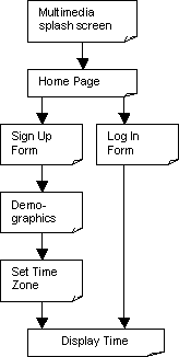
We'll have time later to go into mind-numbing detail, but for now, let's look at a quick flowchart of the service so you get the big picture. This flowchart is not complete, but it does give you the right idea for the "storyboard" of using WhatTimeIsIt.com:

WhatTimeIsIt.com consists of quite a few different screens. Most screens will follow a standard format, with a look and feel to be designed in the future by a graphic designer. This document is more concerned with the functionality and the interaction design, not the exact look and layout.
All screens are created in HTML. (The single exception is the Splash Screen, which is created using Macromedia Shockwave).
Each screen in WhatTimeIsIt.com is known by a canonical name which will always appear, in this document, with an underline, so you know we're referring to a screen by name, for example, Home Page.
An annoying, gratuitous Shockwave animation that plays stupid music and drives everyone crazy. Splash Screen will be commissioned by a high-paid graphics animation boutique in a loft in Soho from people who bring their dogs to work, wear found objects safety-pinned to their ears, and go to Starbucks four times before lunch.
After the animation has played for about 10 seconds, a link that says "SKIP THIS" will fade into view in the bottom right corner. To avoid people seeing this and clicking on it, SKIP THIS will be so far down and to the right that most people won't see it. It should be at least 800 pixels from the left border of the animation and 600 pixels from the top.
Clicking on SKIP THIS goes to Home Page. When the animation is complete, it will redirect the browser to Home Page automatically.
Open Issue
If Marketing allows, we should deposit a cookie on the user's computer if they click SKIP THIS which will cause the animation to always be skipped in the future. Frequent visitors should not have to see the animation more than once. I talked to Jim in Marketing about this and he's going to take point in convening a committee of Sales, Marketing, and PR to discuss.
Displayed when the Shockwave animation is complete, the Home Page serves three purposes:
The Home Page looks like this:
WhatTimeIsIt.com
|
On this, and on all screens, clicking on the WhatTimeIsIt.com logo in the top left corner goes back to Home Page.
Technical Note
Because of the high similarity between the various screens, some system of includes should be used on the server so that if the name of the service changes, or if we can't purchase the domain name we want, we'll be able to change all the screens in one place. I suggest Vignette Story Server. Sure, it's overkill. Sure, it costs $200,000. But it's a heck of a lot easier than using server-side includes!
Clicking on the link that says "click here to log on" goes to Log In Form. Clicking on the link that says "click here to sign up" goes to Sign Up Form. The other five links display pages with static text to be provided by management, which are beyond the scope of this specification. They will not have to change very often.
The Log In Form is used by current members to log into their accounts in order to find out the current time. It looks like this:
WhatTimeIsIt.com
|
The right side of the screen behaves the same way as described previously under Home Page.
The email box allows for up to 60 characters to be typed. The password box allows for up to 12 characters to be typed. To disguise them and prevent hacking, as the user types in the password box, asterisks (*) will appear instead of the characters that they type.
Technical Note
This is accomplished using <INPUT TYPE=PASSWORD>
When the user clicks Log In, the following checks are performed on the server:
If the email address was provided, but it could not be a real email address because it is not formatted correctly (e.g. there is no @ sign or it contains characters that are not permitted in email addresses by RFC-822), the server returns another page that looks just like Log In Form, only this time, a red error message is inserted above the address box, saying "The email address you provided is not valid. Please double check it." Although this text is in red, the text "Please enter your email address" still appears in black. The incorrect email address that the user originally typed will now be pre-populated in the edit box.
If the email address was provided, but it does not correspond to a registered member, the server returns another page that looks just like Log In Form, only this time, a red error message is inserted above the address box, saying "The email address you provided is not a member. Please double check it. To become a member, click on the link on the right side of the screen." Although this text is in red, the text "Please enter your email address" still appears in black. The incorrect email address that the user originally typed will now be pre-populated in the edit box. [ Question to developers. Can we use JavaScript in this case so that if the user then clicks on the link to become a member, we automatically pre-populate the email address on the sign up form? ]
If the email address was provided, and it does correspond to a registered member, but no password was typed at all, we send an email to that address containing the password. The subject of the email is "Your WhatTimeIsIt.com membership". The email is in plain text. The exact wording of this email is still being debated hotly by the board of directors and will be provided sometime before shipping. [ Developers: for now I suggest using a nasty word. That will light a fire under Chucks' seat. ]
If the email address was provided, and it does correspond to a registered member, and a password was provided, but the password is incorrect, the server returns another page that looks just like Log In Form, only this time, a red error message is inserted above the password box, saying "The password you provided is not valid. Please double check it. Remember, passwords are case-sensitive." If the password typed does not contain any lower case alphabetic characters, we add this text to the message: "Perhaps you've accidentally turned on CAPS LOCK?" Whenever the password is incorrect, the Log In Form comes back with the password box clear.
If the email address and password are OK, jump straight to Display Time.
Open Issue
Need to decide about JavaScript in case #2Open Issue
Need wording for password email from CEO
Back to Joel on Software